There is a short window in November when “I should make something for Christmas” is still a realistic sentence. The fabric has to be chosen, printed, shipped, cut and sewn, and all of that has to happen before the week everything else happens.
So this is not a post about which print is prettiest. It is sorted by what you are making, because that is the question that actually narrows a whole collection down to two.
Why sorting by project beats sorting by colour
When I laid the whole collection out, the first thing I noticed is that it is unusable as a list. A whole collection is not a choice, it is a wall.
What makes it a choice is deciding the object first. A tablecloth wants a different print from a child’s nightdress, and both want something different from one papered wall. Once the object is fixed, three or four prints are obviously right and the rest stop competing.
Here is how I would split them.
For the Christmas table

Table linen is seen flat and from above, which means a print with structure holds up better than a scattered one. Plaids are the safest thing you can put on a table: the grid does the work and nothing lands awkwardly at a fold.
Classic Christmas Tartan in red, green and navy is the anchor. Red Tartan with Ivory Star Flower is the same plaid with a single flower set in at wide intervals, which gives a runner something to look at without turning it into a pattern. Christmas Roses on Red Tartan puts full crimson roses over the weave if you want the table to be the loud thing in the room. And Christmas Ribbon Stripe in red, green, ivory and black is the one I would use for napkins, because stripes at ribbon width calm down every floral they sit beside.

A note on scale: table linen is one of the few projects where going up a size helps. A print that looks right on a dress often reads as busy across six feet of cloth.
For a dress or a blouse you will actually wear again

This is where most Christmas fabric goes wrong. A print covered in Santas is a costume by the twenty-sixth of December.
The ones that survive January are the florals that happen to be in Christmas colours. Winter Rose Toile de Jouy is a single-colour engraved toile of magnolias and roses, and none of its colourways say Christmas out loud. Christmas Roses and Pine has deep red roses with holly and snowflakes over a muted ground; the grey-blue and beige colourways are quiet enough for everyday. Tiny Rosebud Ditsy Winter Floral is the smallest-scale print in the set, rosebuds spaced wide on a dark ground, and it is the one I would choose for a blouse.
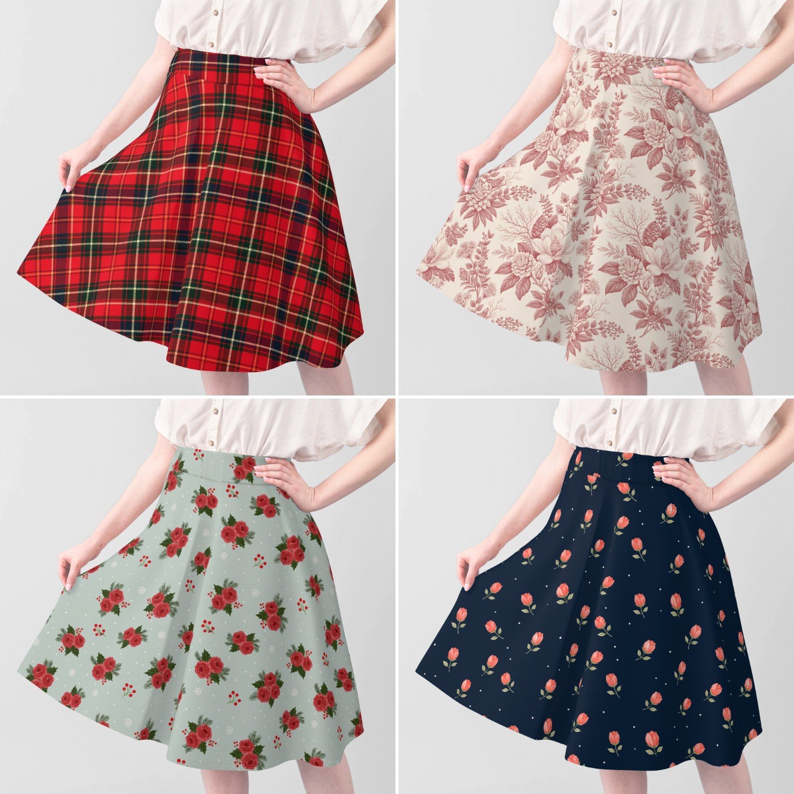
For anything with a skirt, pick a base cloth with drape rather than a quilting weight. The print will look the same on both; the garment will not.
For children’s clothes and pyjamas

Children are the one audience that wants the print to be obvious, and small scale matters more than anything else — a large motif on a small garment gets cut into pieces that no longer read as anything.
Ditsy Christmas Bells Trees and Gingerbread is drawn for exactly this: bells, little fir trees, gingerbread men and candy canes packed close. Sparse Gingerbread and Snowflakes on Ice Blue is the opposite approach — almost all negative space, which suits a nightdress. Vintage Toy Shop Rocking Horse and Train has a rocking horse, a teddy and a toy drum set far apart, soft enough for a nursery. And Christmas Icon Toss with Stockings Trees and Gifts is the busy, cheerful one.

For one wall, not the whole room
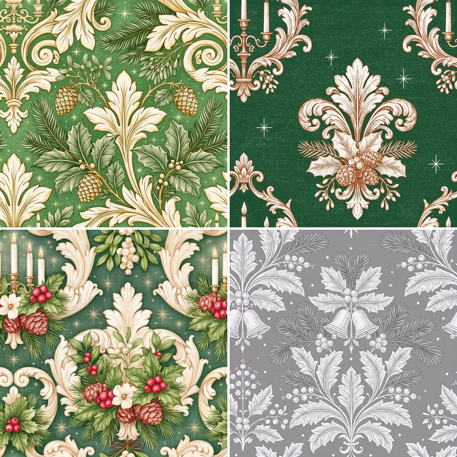
Wallpaper is the thing people talk themselves out of, usually because they are picturing four walls. One wall is a different project, and a formal damask is the easiest way to do it.
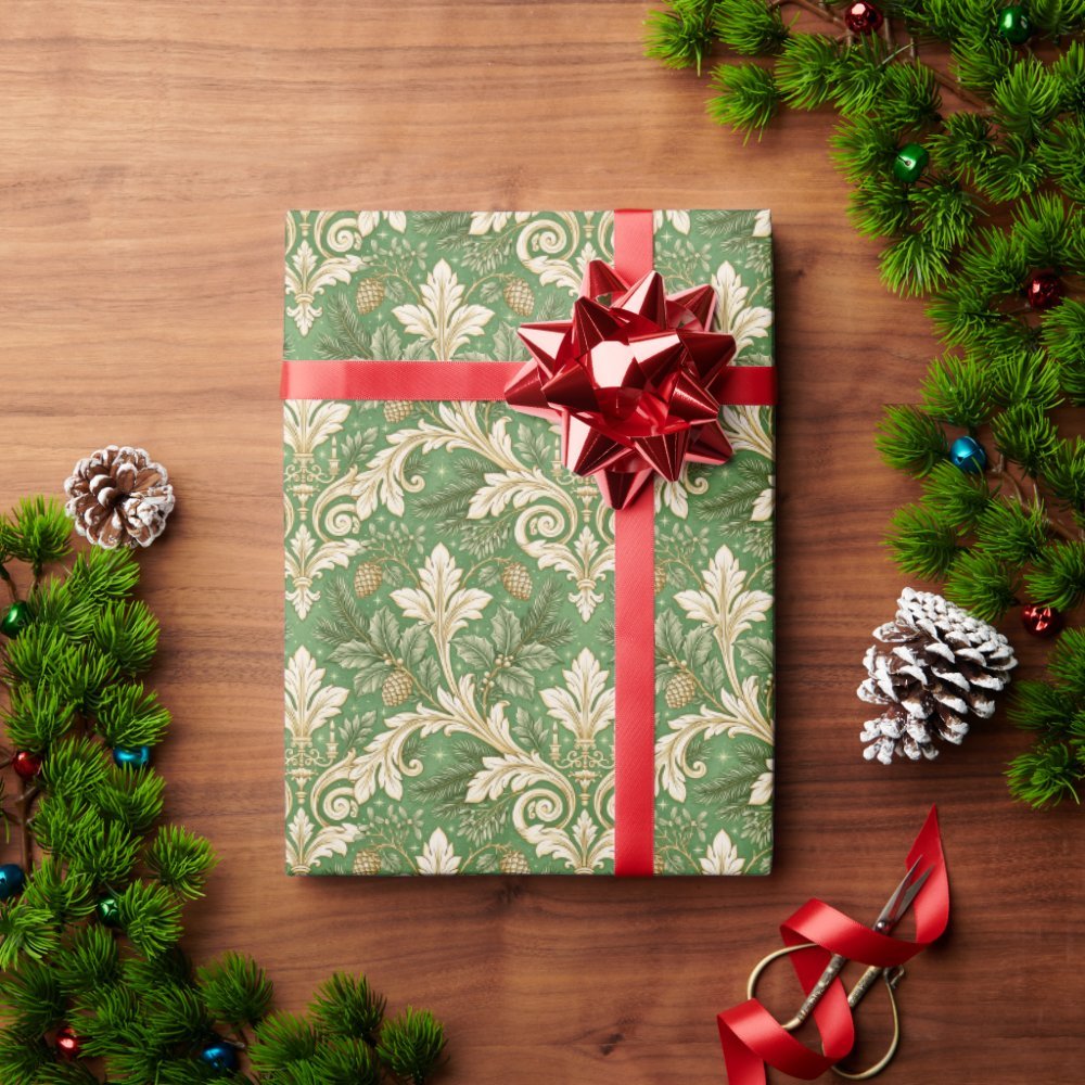
Gilded Acanthus Christmas Damask in forest green and gold is the most traditional in the collection. Candelabra Christmas Damask and Baroque Christmas Damask with Candles both build lit tapers, holly and pinecones into the scroll. Tonal Holly and Bells Damask is the restrained one, worked tone on tone so the pattern reads as texture rather than colour — that one stays up all year.

Every print in the collection is available as both fabric and wallpaper, which is worth knowing if you want a wall and a cushion to match.
For stockings and the small things
The prints that are too much for a garment are often perfect at small sizes. Vintage Glass Ornaments and Gold Bows is dense enough that almost no ground shows, which makes a beautiful stocking cuff and a terrible dress. Bold Santa Faces and Candy Cane Stars belongs on the front of a stocking. Strings of Christmas Lights repeats horizontally, so it suits anything long and narrow — a runner, a stocking, a tie-on bow for the tree.
Three things worth knowing before you order
Check the scale at actual size, not on screen. Every design page lets you preview the repeat at different sizes, and a print you loved at thumbnail scale can turn out to be much larger than you pictured. This is the single most common disappointment with printed fabric, and it takes thirty seconds to avoid.
Order a swatch if the colour matters. Screens are optimistic about reds. If the fabric has to sit beside something you already own, a swatch first is cheaper than a yard you will not use.
Leave more time than feels necessary. Spoonflower prints every order when it arrives rather than holding stock, so there is a production step before anything ships. In past years their order-by dates for Christmas delivery in the US have fallen in the first half of December, with international dates a couple of weeks earlier — check their current deadlines before you plan backwards from a date.
Where they are
The whole collection is here: Pearl & Ruby Christmas on Spoonflower. Every print in the collection was drawn for this set, and each one is available as fabric and as wallpaper.
If you want to see them moving rather than listed, the one-minute run through the whole collection is above.
I drew these the way I would want to sew them — a few to make something with, a few to make a room feel like December, and a few that are simply nice to have a yard of.