The wrapping is the first thing anyone sees of a gift. Long before the bow comes off, the paper has already said something about the person who chose it — and a vintage print says it warmly, the way a handwritten card does.
This year I turned my Pearl & Ruby Christmas prints into wrapping paper and matching tissue, and here are a few simple ways to make them look their best. None of these need special skills, just a little planning before the night you sit down with the scissors.

1. Give every person their own print
Pick one paper per person in the house and use it for all of their gifts. On Christmas morning nobody has to hunt for tags, because everyone can spot their own gifts from across the room. It also makes the pile under the tree look planned instead of random.
- Keep a small list on your phone of who got which print, so the late gifts match too.
- If there are children on your list, let them pick their own print.
- For couples, two prints from the same colour family look lovely side by side.

2. Line the box with matching tissue
The moment someone lifts the lid is the second reveal, and it is the one most of us forget. Tissue in the same print as the outside paper makes even a plain cardboard box feel like it came from a boutique.
- Use two sheets crossed in an X so the corners fold over the gift.
- Tuck the tissue in loosely; a little puff on top looks generous.
- For gift bags, pull the tissue up into soft peaks so the print shows above the handles.
Each wrapping paper in the collection has a matching tissue paper, so the inside and outside always agree.
3. Mix prints that share a palette
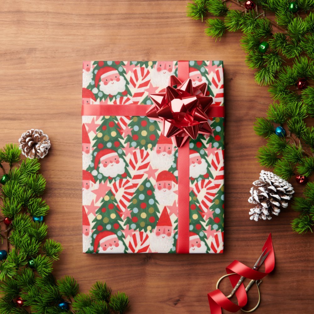
If one print feels like too much, mix two or three that share the same colours. Red, deep green and cream are the easiest family — a damask, a plaid and a sprig print can sit together because the colours do the matching for you.


- Rule of thumb: one large print, one small print, one stripe or plaid.
- Keep the ribbon the same across all of them — that is what ties the group together.
- Navy is a good outsider: string lights on navy look fresh next to all the red and green.

4. Choose ribbon that suits a vintage print
Vintage prints are already busy, so the ribbon should calm them down rather than compete.
- Red satin or velvet on green, cream or navy papers.
- Cream or ivory on red papers, so the print stays the star.
- Baker’s twine plus a sprig of real pine or a dried orange slice for a homemade look.
- Skip glitter bows on detailed prints — they hide the pattern you chose.
5. Match the print scale to the gift
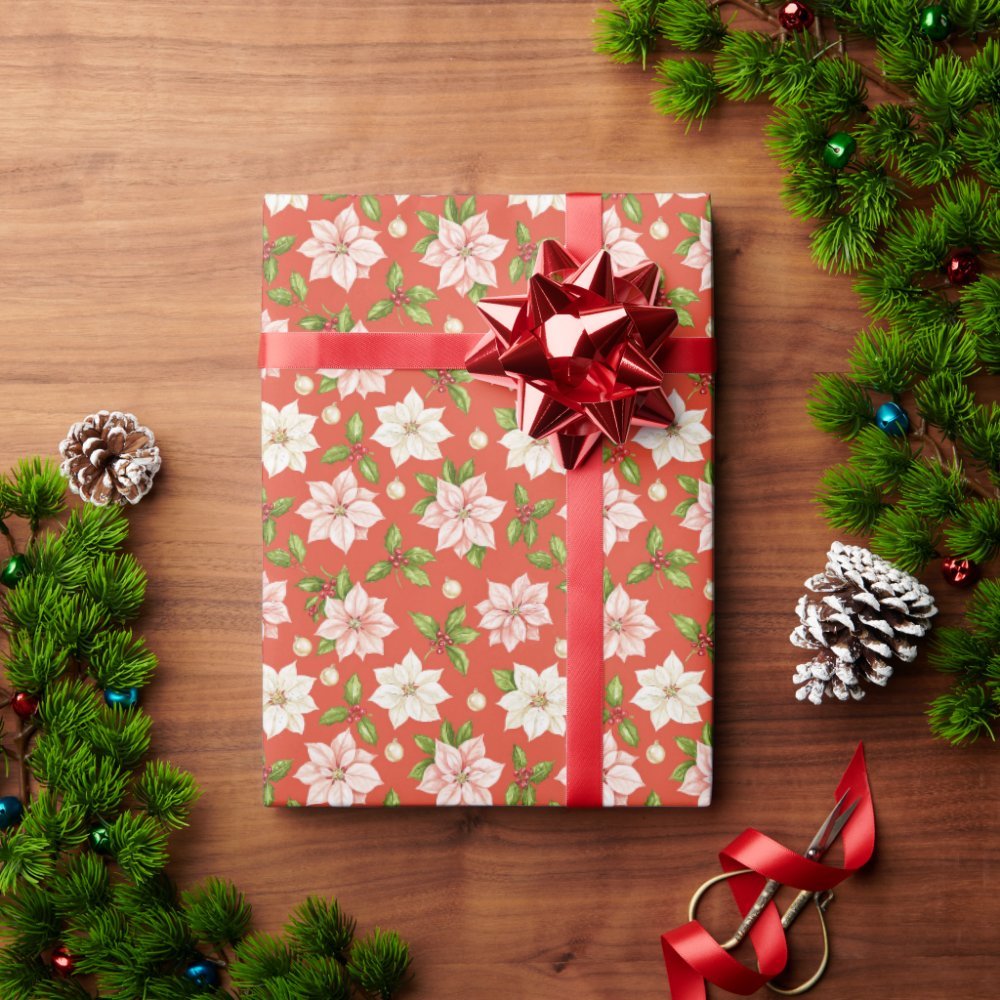
Large damasks and big florals look best on big boxes, where you can see a whole motif. Small, scattered prints like rosebuds or ornaments work better on small gifts, jewellery boxes and books, because a tiny box only shows a few inches of paper.
A quick test: hold the paper against the box before cutting. If you can’t see at least one full motif on the front, switch to a smaller print.
6. Take the print onto the wall
If you love a print enough to wrap with it, it can go further than the gift table. The same designs come as removable peel-and-stick wallpaper — a single accent wall behind the tree or in the entry makes the whole room feel dressed for the season, and it comes down easily in January.


Where to find these prints
All of the papers in this post are my own Pearl & Ruby Christmas prints. I design them with AI-assisted tools and finish them by hand, and they are printed and shipped by Zazzle.
- Christmas wrapping paper — every print as a gift wrap roll
- Gift wrap set — wrapping paper with matching tissue paper
- Christmas wallpaper — peel-and-stick versions for walls
Order early if you can. Wrapping paper is one of those things that feels optional until the evening of December 23rd.